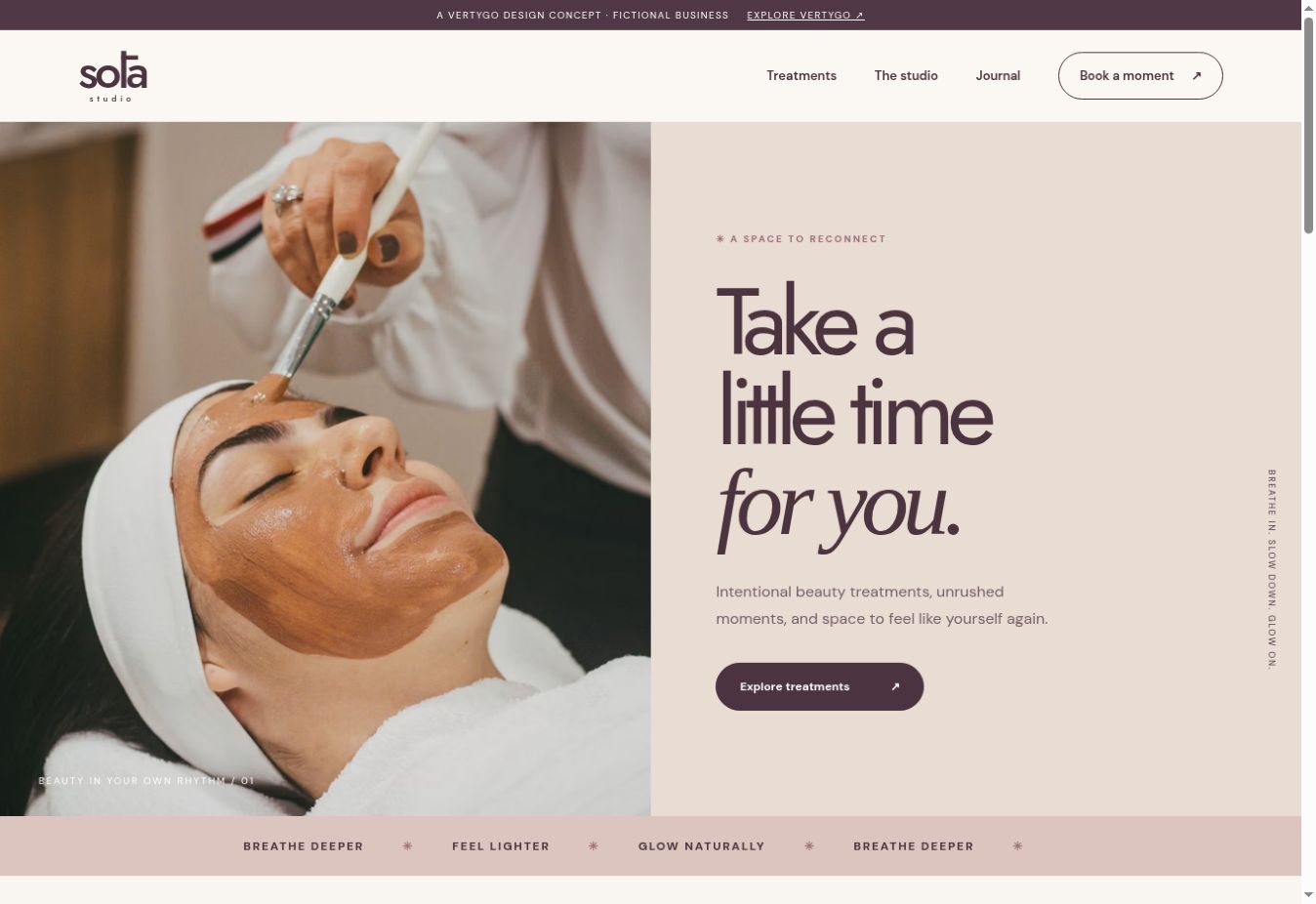
A beauty website can feel calm, personal and distinctive while still being easy to use. The practical information is part of that experience: someone should be able to understand the treatment, find the location and see how to ask about an appointment.
Vertygo's Sōla Studio demo explores one visual direction. It is a fictional studio, with illustrative treatments and booking interactions. It is an example to discuss, rather than an operating salon or a ready-made description of your services.
Build the treatment list around real decisions
For each treatment, gather the information your business can confirm. A name alone may not help a first-time visitor choose. Add a plain-language description, typical duration, price or pricing basis, and how an appointment is arranged.
If consultation is required before a particular service, say so. Have the business verify suitability information and any claims before publication; a designer should not invent them to fill the page.
Show the place and the people accurately
Real photographs can introduce the studio and the person delivering the treatment. Label illustrative imagery honestly, and obtain permission before publishing identifiable client photographs or reviews.
When selecting a photograph, consider its job in the page. A studio interior gives a sense of the location. A treatment image explains the service. Repeating a decorative image across every treatment is less informative than choosing one that belongs with the description.
Make booking expectations clear
A booking request and a confirmed appointment are different outcomes. Decide what the website actually offers:
- A request form that the business reviews.
- A link to an existing appointment system.
- An integrated booking system with live availability.
Use button and confirmation text that matches the process. If submitting a form only requests an appointment, do not tell the visitor that their booking is confirmed.
Test a first visit on a phone
Open the website without relying on your knowledge of the business. Can you find the treatment price, address, opening hours and contact route? Does the booking link work? Are labels readable and buttons comfortable to use?
Give the same attention to practical pages as to the homepage. A beautiful introduction should lead naturally into a clear decision and a reliable next step.
Further reading
Google's image guidance recommends descriptive alternative text and images placed alongside relevant content. Write image descriptions for the photograph in front of you, rather than filling them with repeated search terms.